New Retailer Packaging
A new retailer is holding our product!
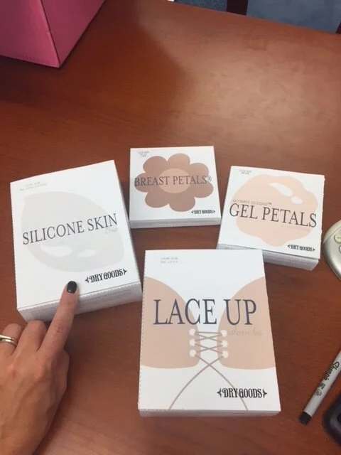
Which means they need a package design. Their theme is navy and white. I had to make it look “young” so I illustrated the product on the front of each box. They supplied a list of Typography and I matched the fonts that went best together. Below is the final product:
Mock ups!


